
1
2
3
4
5
6
7
8
9
10

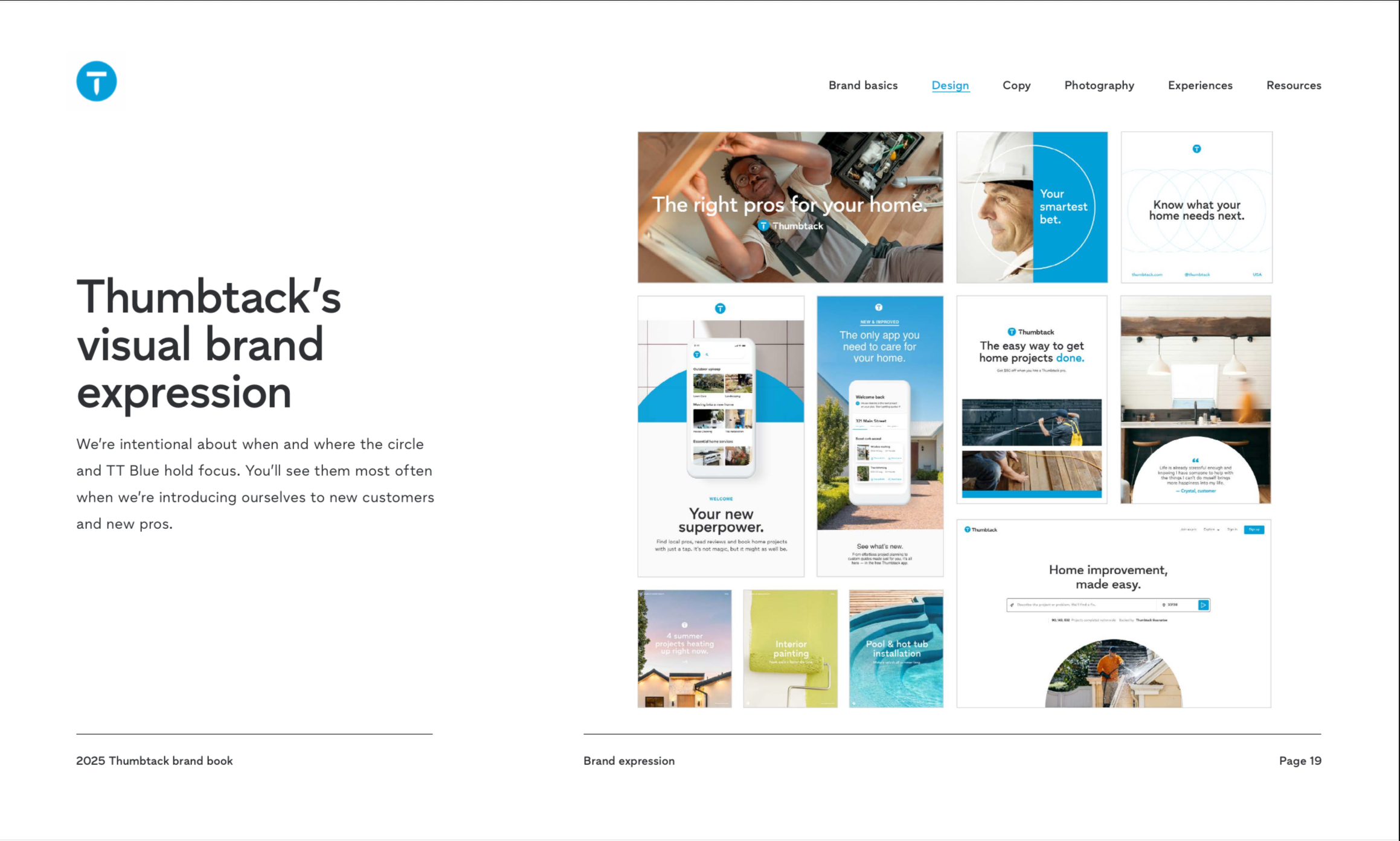
Circular home care takes center stage in the updated brand expression, brought to life through the circular motif drawn from the Thumbtack mark.
Refreshed imagery strikes a more mature, relatable tone for real homeowners, while the brand’s established equity in Thumbtack Blue and negative space is preserved and strengthened. Older primary shapes and colours that lacked intentionality have been stripped away, leaving a more purposeful visual language — one that moves Thumbtack beyond the feel of a typical tech company toward something warmer and more human. Simple, clear and malleable while still feeling relatable and approachable.